
Photographs – the current bane of my existence.
I have finally gotten off my butt and have started taking photographs of jewellery for my shop. I should clarify – I have started taking photographs, but none of them are attractive or pleasing, and they will not be posted. They are in focus, though, so that’s a step in the right direction!
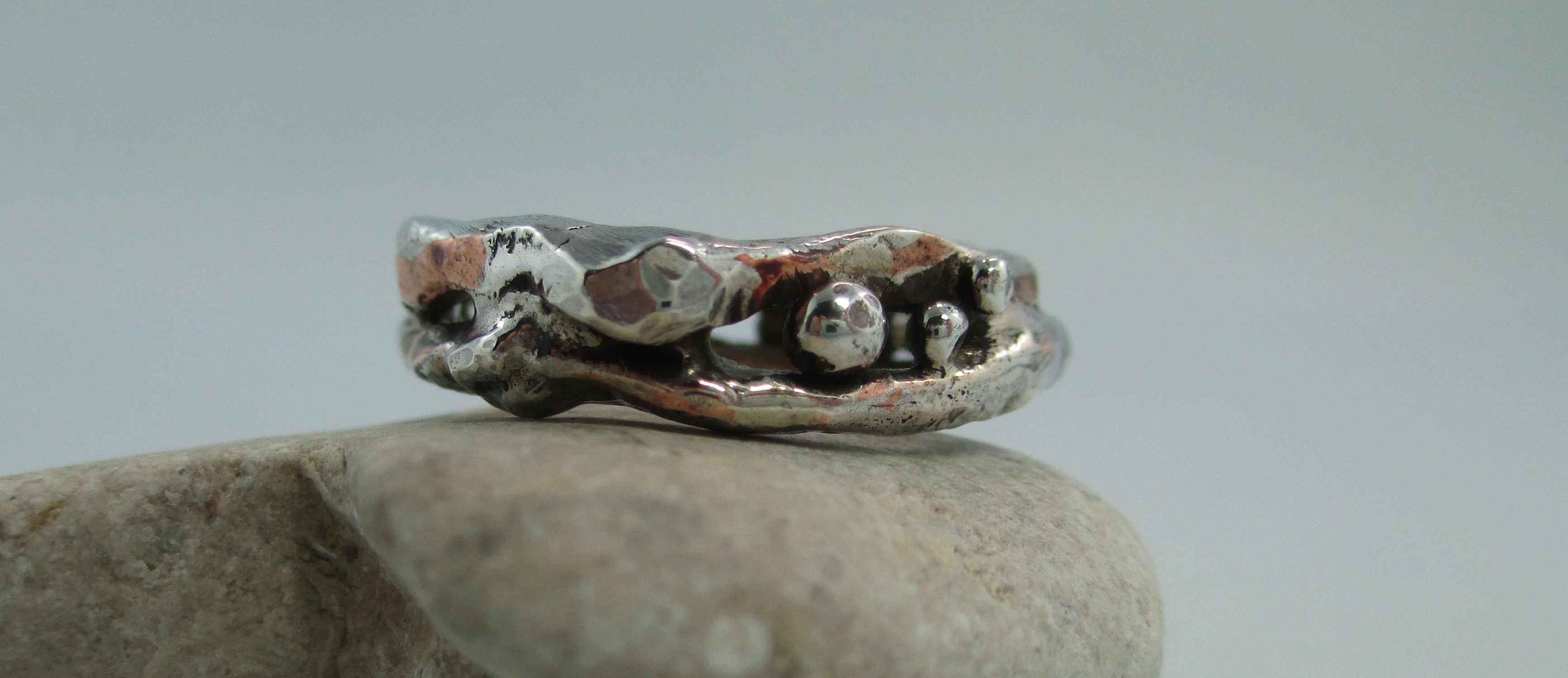
In focus, but looks like it was taken on a dark and stormy day
I have found that deciding on a consistent style for jewellery photos is difficult. And lighting… don’t get me started on that! I’ve been looking at various blogs on photography for tips on lighting / focus / backgrounds, and I’ve come to the conclusion that I just don’t know what to do.
Many articles that I’ve read state that the best way for jewellery to be displayed in photos is with a white background, making the object appear like it is floating. I understand that this is useful when the photo is being posted on various sites, although I don’t fully understand why (I had generally lost interest by that point in the article – I seem to have a short attention span sometimes). I do agree, however, that the white background is best to show off the true colour of the metal and any beads or stones that are set within the piece. The less busy-ness around the item, the better it shows.
In many cases I find the white to be dull. There are exceptions, though. For example, I follow @metalurj on Instagram (website: http://www.metalurj.com/) and I consider their style of pictures to be one of those exceptions. Their pieces are very strong and focused against a brilliant, somewhat over-exposed white background. They stand out, even with “just white”. The style of the jewellery works really well with no distractions, and looks stronger and more industrial for it.
Part of my problem with the plain background is due to the fact that I’m having a heck of a time with white balance – my photos are either a depressing grey or overexposed. When the plain background is done well – ka-pow! – fabulous image. When it is done poorly, well, there is no ka-pow… only a sad little whimper of an image.
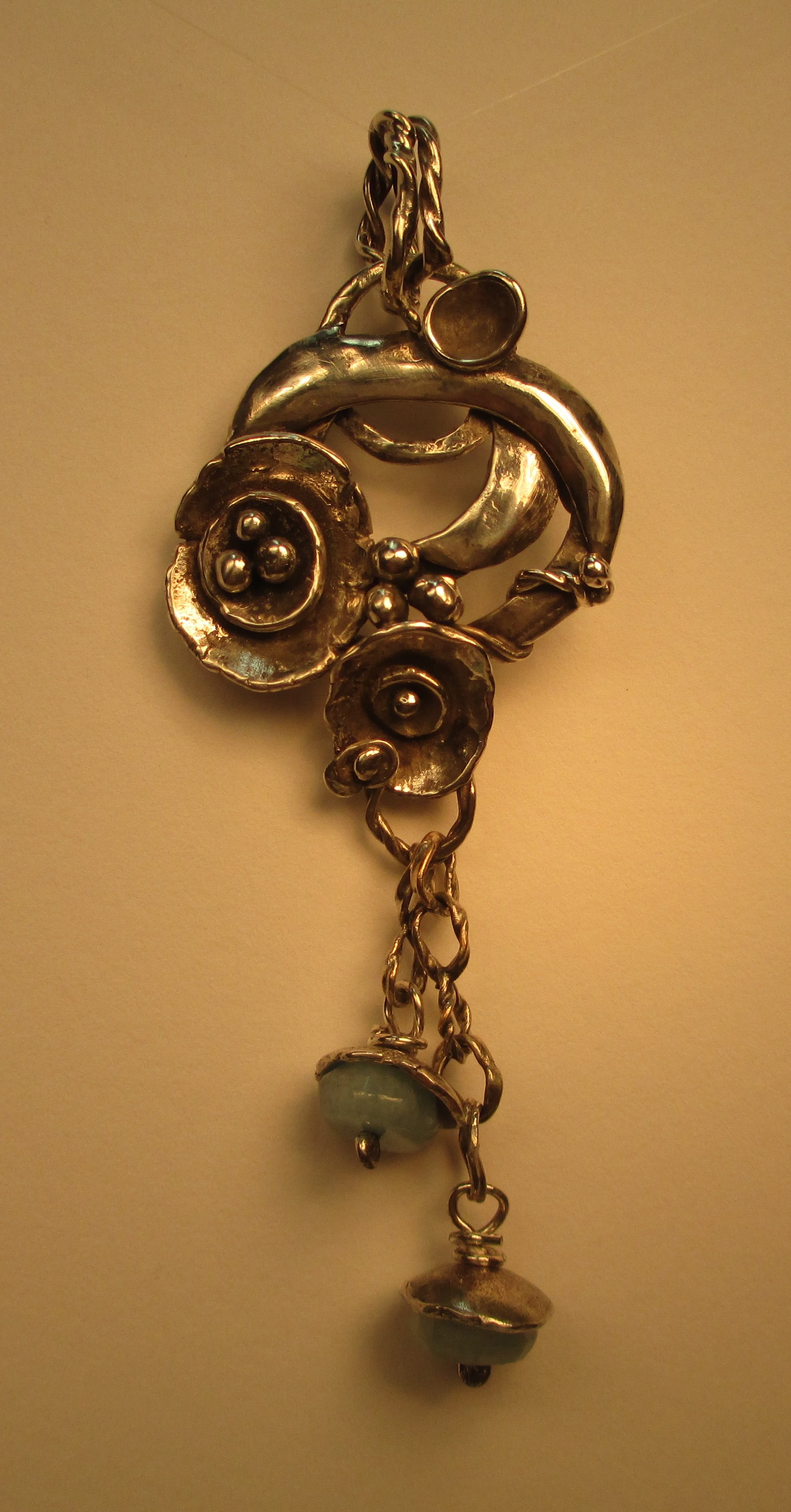
Warmed up from depressing grey, but yikes – it’s sure yellow! This is with normal lightbulbs which were directed at the pendant.
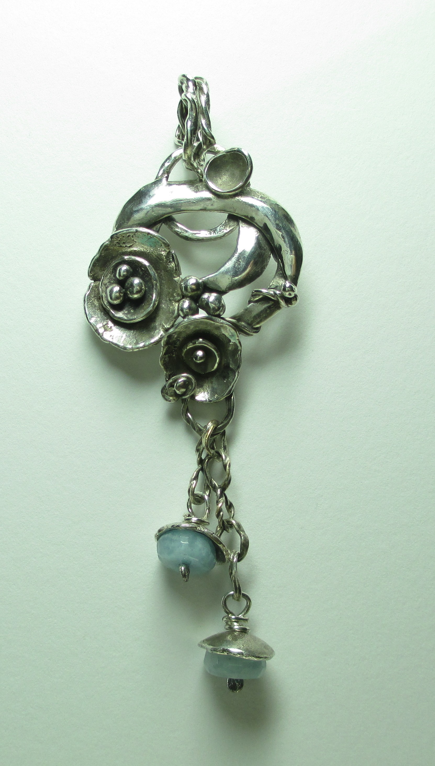
Using an Ott-Lite.

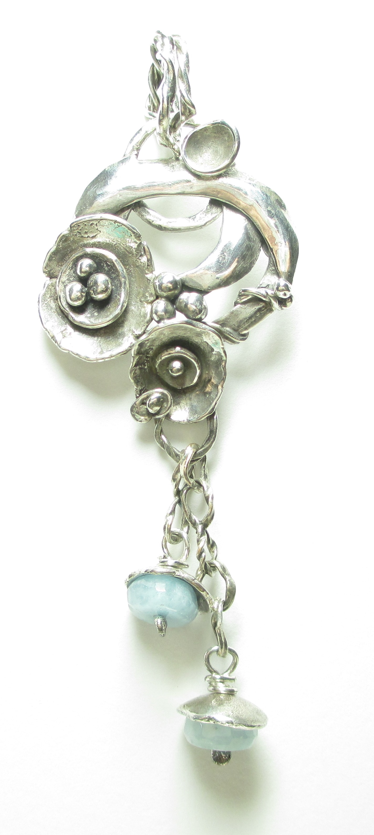
Changed the white balance on my camera – it definitely helped, but I’m still lacking crispness.
Went a little white balance crazy with my camera.
But I have a little secret to tell you… I like busy-ness. I enjoy an artistic shot with pleasingly placed props. If the jewellery is in focus and there isn’t an overabundance of filters on the photo, I’m happy.
What’s a girl to do?
I think I need to start listening to what I like, and what I think portrays the piece of jewellery in the most honest and attractive way, and if the time comes that I need to do an all-white background, well, maybe that’s the time to hire someone with the right set-up who has experience taking jewellery photos.
Any photographers or jewellery picture-looker-at-ers with thoughts on this? What catches or upsets your eye when you look at pictures of jewellery?